
Creating Project Youth, part two: From feedback to final design
Author: Joel Winston, Head of Communications
Developing the Project Youth name was only one part of creating our new identity.
The logo, colours, typography and overall visual style are also important to help people recognise and engage with the study. We wanted these elements to communicate energy and relevance to young people while also giving parents and carers confidence in the study.
That presented an interesting design challenge. Our identity needed to appeal to children as young as eight without excluding older teenagers and young adults. It had to feel approachable without appearing childish, and engaging without losing the credibility expected of a major health research study.
Rather than making assumptions about what these different audiences would like, we asked them.
Developing the creative options
Early designs were reviewed by members of the team and five Young Research Advisors. Their feedback helped us refine the different approaches before putting three options in front of a much larger audience.
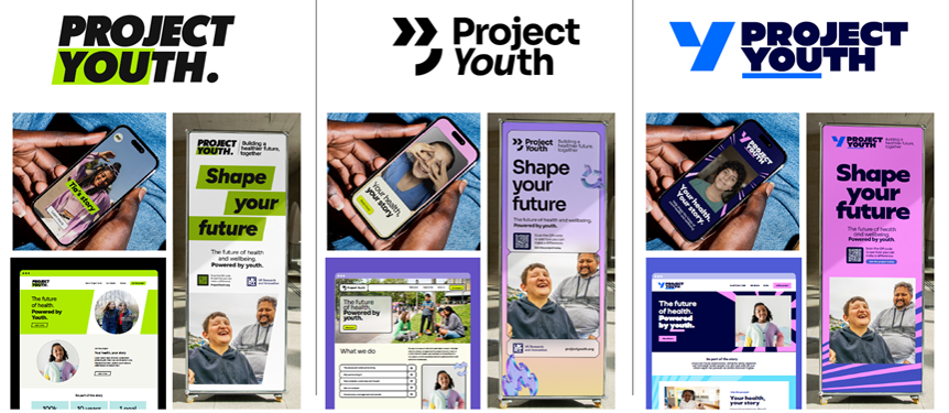
Three options for visual approaches that were tested in a survey.
More than 2,000 young people and 1,300 parents took part in a nationally representative online survey. We analysed responses by age group so that we could see not only which option was preferred overall, but whether any of the designs worked particularly well, or less well, for certain audiences.
One of the three concepts produced the strongest results across several measures and ended up informing our final design.
It received the most positive initial reaction, with 81% of respondents saying they liked it. It was also rated most highly for each of its individual design elements, including the logo, font, colours and emphasis on “you”.
The design also performed best when respondents were asked whether it made them want to find out more about the study. This was an especially important measure for us, because the identity ultimately needs to encourage interest and participation in the study rather than simply looking attractive.
At the end of the survey, it was selected as the overall favourite by 39% of respondents and had the lowest rejection rate, at 9%.
There wasn’t much variation between the different groups of people (age, gender, ethnicity or socioeconomic group). But the 17 to 19-year-olds seemed to slightly favour this design even more than the other age groups.
Looking beyond the overall result
The survey did more than identify a winning concept. It helped us understand why certain elements worked and where further improvements might be needed.
We explored the visual approaches in more depth through focus groups. Participants again represented a mixture of backgrounds, UK locations and socioeconomic groups.
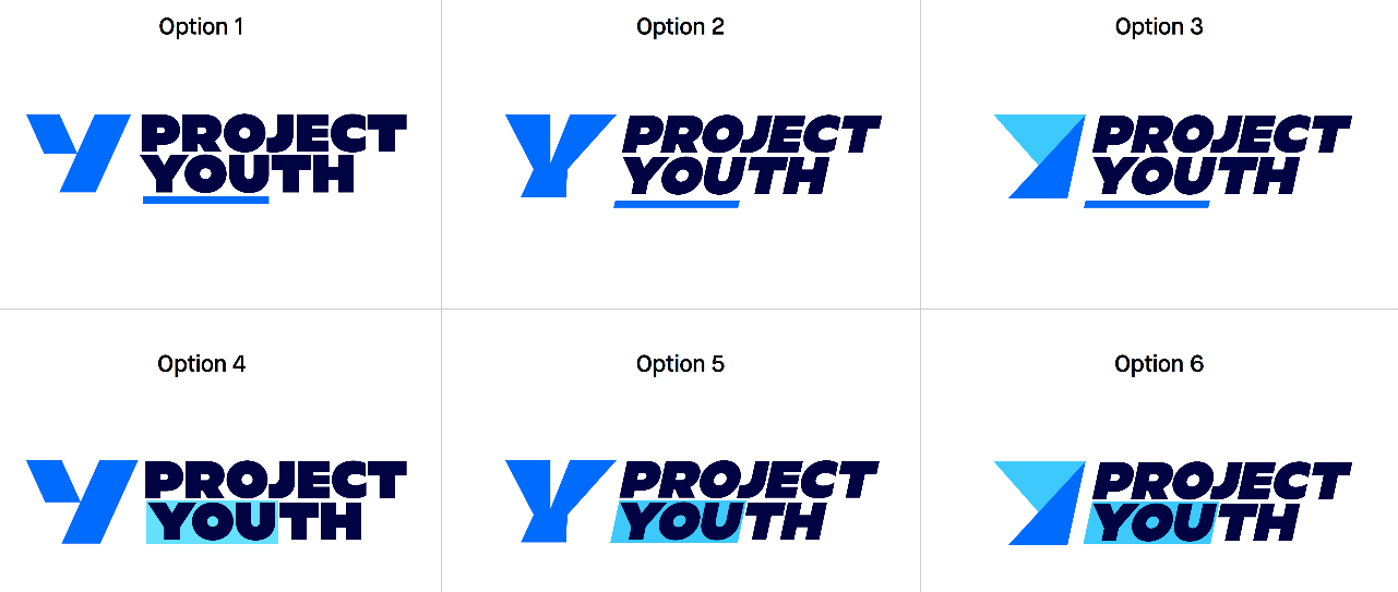
Six variations of the most popular design that were shown to focus groups.
We showed a few variations of the design and asked for their feedback on each. These conversations helped us understand reactions to the designs in more detail.
Participants liked the two-tone use of colour in some of the design approaches. The slanted logo and italic typography also created a feeling of movement and energy, which was particularly appealing to young people.
The discussions also revealed areas that we needed to think about further. Some participants wanted to see a broader selection of colours. This led us to create a wider palette of colours, bringing greater variety and flexibility while retaining blue as its primary colour.
We also needed to make sure our final design was accessible and will explain more about this in the next blog post.
Creating the final identity
The final design for Project Youth brings together the elements that performed most strongly and incorporates refinements made in direct response to feedback.
It balances energy with credibility. It highlights the role of young people while retaining the clarity and sense of trust expected of a long-term health research project.
Most importantly, it is based not on assumptions about what young people and parents might respond to, but on what they actually told us.
The final Project Youth logo
Coming soon: ‘Part three: Accessible by design’