
Author: Joel Winston, Head of Communications
Accessibility was an important part of our brief for the Project Youth branding from the beginning. We want to involve young people from a wide range of backgrounds, with different needs and experiences. Our identity and communications must therefore be understandable and usable by as many people as possible.
This means thinking beyond whether a design looks attractive. Choices about typography, colour, contrast and spacing can all affect how easily someone can understand and navigate information.
To explore this properly, we combined our wider audience testing with a dedicated accessibility focus group.
Learning from lived experience
The accessibility group involved 13 participants aged 16 to 25 with lived experience of neurodivergence, visual processing differences, and sight-related impairments.
The group assessed different visual options for logos and colour palettes and considered how accessible these elements would be in practice.
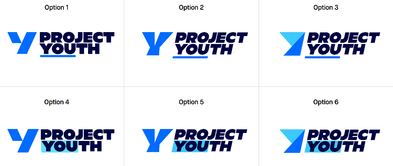
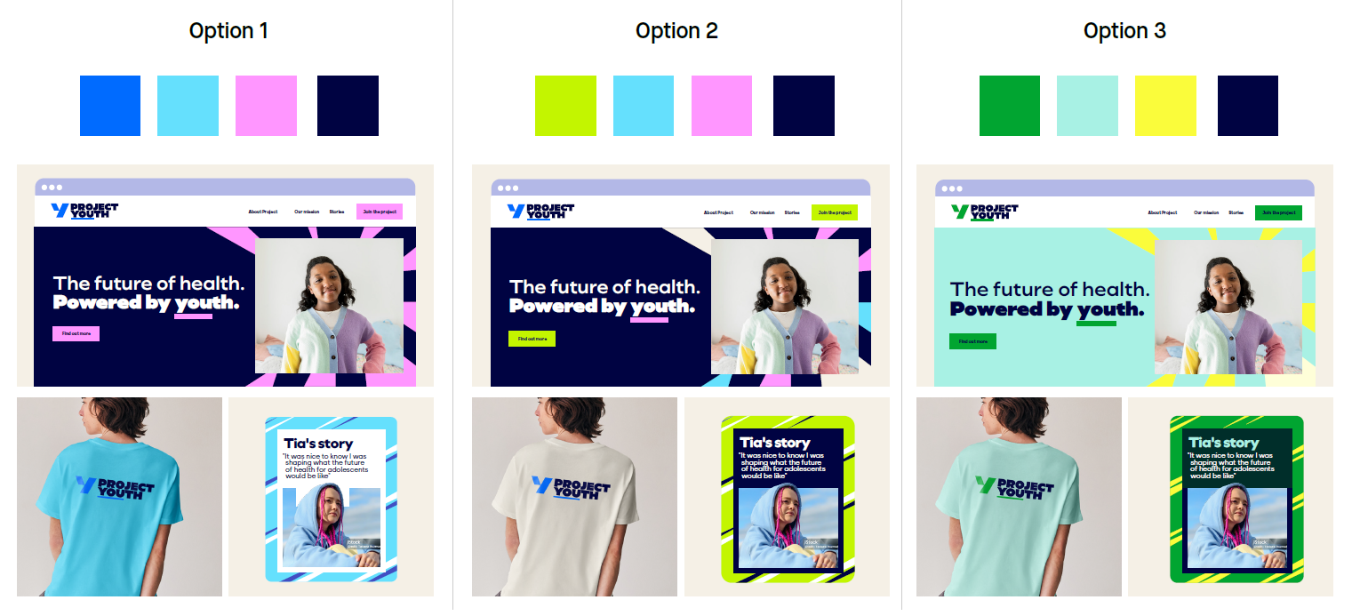
The design that had performed most strongly in our wider audience testing was also considered the most accessible logo option by the group. This gave us useful evidence that the preferred creative direction could provide both broad appeal and accessibility.
However, the group identified practical ways in which the identity and its application could be improved.
Turning recommendations into design decisions
Participants recommended using a slightly lighter font weight in the logo and avoiding heavily weighted typography in body text of any materials.
Bold text can be useful for creating emphasis and helping people navigate a page. However, frequently switching between different font weights, or using very heavy typography across longer passages, can make information more difficult to process.
The group also recommended maintaining strong contrast between text and background colours.
Spacing was another important consideration. Leaving adequate space between words, letters and visual elements can reduce cognitive effort and help people navigate information without facing too many competing features at once.
These recommendations influenced both the final identity and the principles for applying it across our communications.
Applying these principles beyond our brand
The development process helped us identify potential barriers before our identity was finalised. People with relevant lived experience were able to influence choices that might otherwise have been made without their input.
As the Project Youth branding is applied to more channels and materials, the principles identified through the accessibility testing will need to guide how those communications are developed. Strong contrast, appropriate typography, clear spacing and carefully selected colours must be used consistently throughout the life of our study.
Accessibility also benefits a much wider audience than those with a recognised condition or requirement. Clearer information, readable text and less visual complexity can make it easier for everyone to understand and engage with the study.
By including accessibility in the development process and involving people with lived experience, we have established a stronger foundation for the Project Youth identity.
The final Project Youth logo